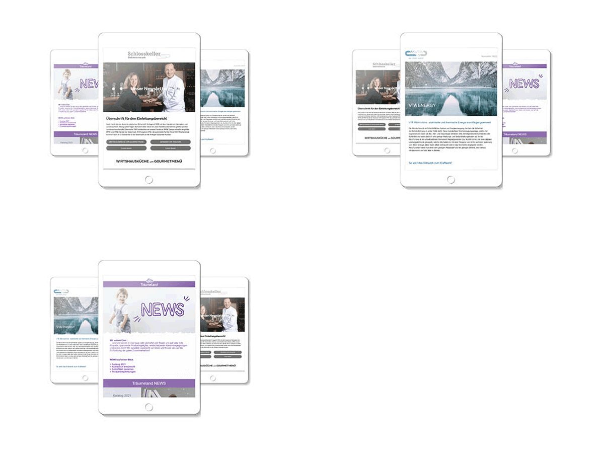
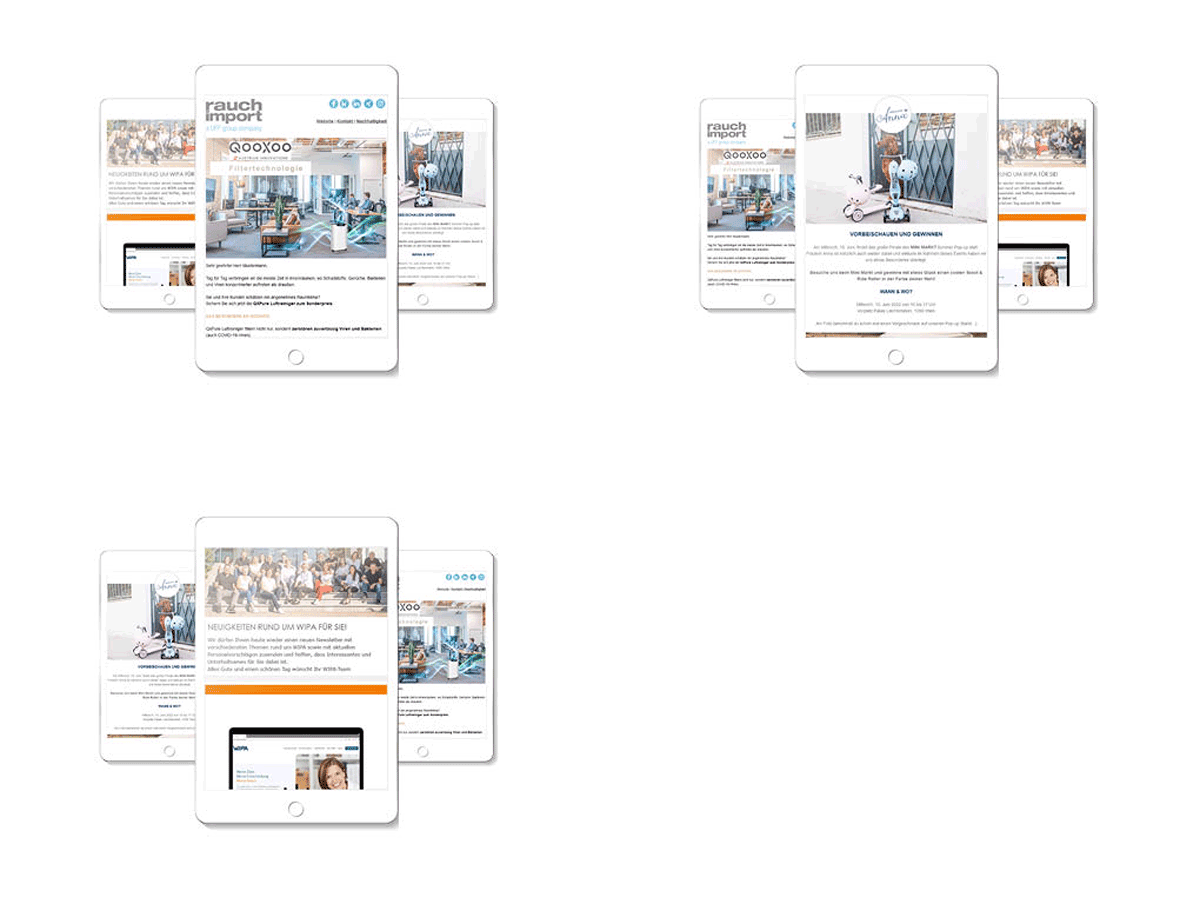
Newsletter Templates.
Cool and fresh.
The design of your newsletters is the flagship of your campaigns. We design your newsletter templates so that they convince – both you and your customers.

Individual newsletter templates
Create a visually appealing design with an individual newsletter template, perfectly matched to your company’s corporate design.
Stand out from your competitors in your subscribers’ mailbox and create a recognition value in all your marketing activities. We support you throughout the project and implement your individual newsletter design, if requested.
Customized Design that suites you

Flexibility
We offer the highest flexibility in creating your campaigns. You decide which section type you need, including their design in color and shape.

Recognition value
Your corporate design perfect staged. Consistent marketing activities across all channels will remain in your customers’ minds.

Stand-alone feature
Stand out from your competitors in your subscribers’ mailbox, with your own individual template. It directly increases your success.

Increase clicks
You can build a newsletter structure that perfectly fits on your subscribers’ click behavior – the call-to-action is perfectly integrated.

Professionality
We guide you through the process to your individual newsletter template. Benefit from our experience and expertise in this particular area.
Flexible newsletter templates
Our prefabricated template supports you with multiple setting options in designing your campaign. Design a personal and individual flagship for your company. The prefabricated template is extremely convertible and directly ready for use.
You are experimental and want to easily implement the look of your newsletter according to your own ideas? Then the prefabricated newsletter template called Layout Pure is all you need.

Fast and flexible? Both works!

Background
Choose between a campaign background or section backgrounds, which run across the entire width.

Table of content
Define, if you want the table of content to be shown single- or multi-column, or hide it, if you wish for.

Footer
Beside various information about your company and the most essential links, you can also insert images in the footer.

Headlines
Define individually the most important parameters for your headline, to make your newsletter even more reader friendly.

Textfields
Font, font size and color settings can be easily adjusted to your corporate design.
Mobile first – what you need to know!
If most of your subscribers open your newsletter via mobile devices, you should pay attention to the special needs of the proper devices. Especially, if it’s about creating your individual template or inserting content to your campaign.
Specifics of mobile-first
On smartphones the amount of space is less than on desktop devices and affects design, layout and the content of your campaign. We summarized the most valuable tips, for an optimal presentation of your newsletter.
Design
If creating a newsletter design for mobile devices, you should note the following:
- At first, to get an exact image how the newsletter is going to look like on it, a design for mobile devices should be created.
- Call-to-action are designed with a large surface, to guarantee an easy usability by gesture.
- White spaces should be integrated, to visually highlight content and for better readability.
- Readable fonts and font-sizes are important, to get a subscriber from opener to reader.
Layout
If creating a newsletter design for mobile devices, you should note the following:
- The amount of space on mobile devices, is only suitable for single-column elements.
- Different areas of color suite well, to highlight different topics.
- Powerful images loosen up the newsletter and make it to an eye-catcher.
- The introduction should not only have short text passages. Instead of using a big header image, make use of the company logo.
Content
To get your content to be shown the best way on mobile devices, follow the tips below:
- Use only a few characters in the subject- and preview-line, to get your subscribers to open your newsletter.
- Important information should always be placed at the beginning of the newsletter.
- Too many topics will drag out a newsletter, especially on mobile devices. Better concentrate on less but meaningful topics.
- The usage of call-to-action buttons with large surface not only make it easier to click on, but also stand out and increase click-rate.
- The following applies to the text length: “Less is more!” – further information for a special topic can be offered by using landing pages.
- Valuable space in the newsletter should not be wasted with images, logos or empty phrases. Because of things like that, subscribers are losing interest in reading your newsletter.
- Newsletters on mobile devices often get scrolled faster. To positive effect newsletter-scrolling, it should be worked with different eye catchers.